What is Mappen?
My Role
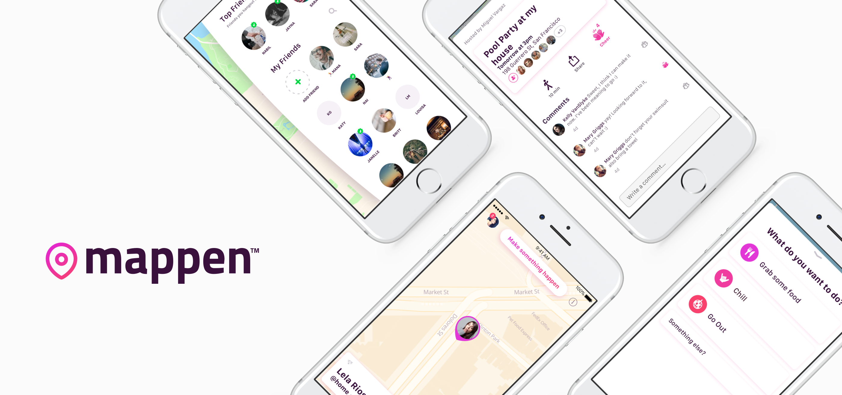
Mappen is a map-based app that aims to help teens get together in person.
Platforms
iOS, Android, Mobile Web
Worked with 2 other designers to create & finesse the app from scratch
Led the user research initiative to arrive at user needs
Led the user testing of the app, to improve usability
Led the Android design
Research & Findings
1000+
Students surveyed via Instagram surveys.
50-70
Interviews with high school and college students.
Pain Points
Texting is an inefficient way to plan group get-togethers.
Overscheduled teens don't know when their friends are free.
Spending too much time on Instagram makes teens depressed.
Motivations
Spending time with friends in a low-key way.
Personas
Stacy Starter

"It's so hard to get everyone to agree on what they want to do"
Stacy makes plans for her club, team, and church group.
She always organizes hangouts with her BFF's.
Stacy is always coordinating everyone's schedules for special events.
Jake Joiner
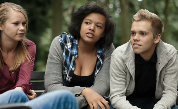
"I donno. What do you wanna do?"
Jake is intimidated by the idea of intiating a hangout.
He always wants to be included.
Jake is worried about missing out on what other's are doing.
Original Solution
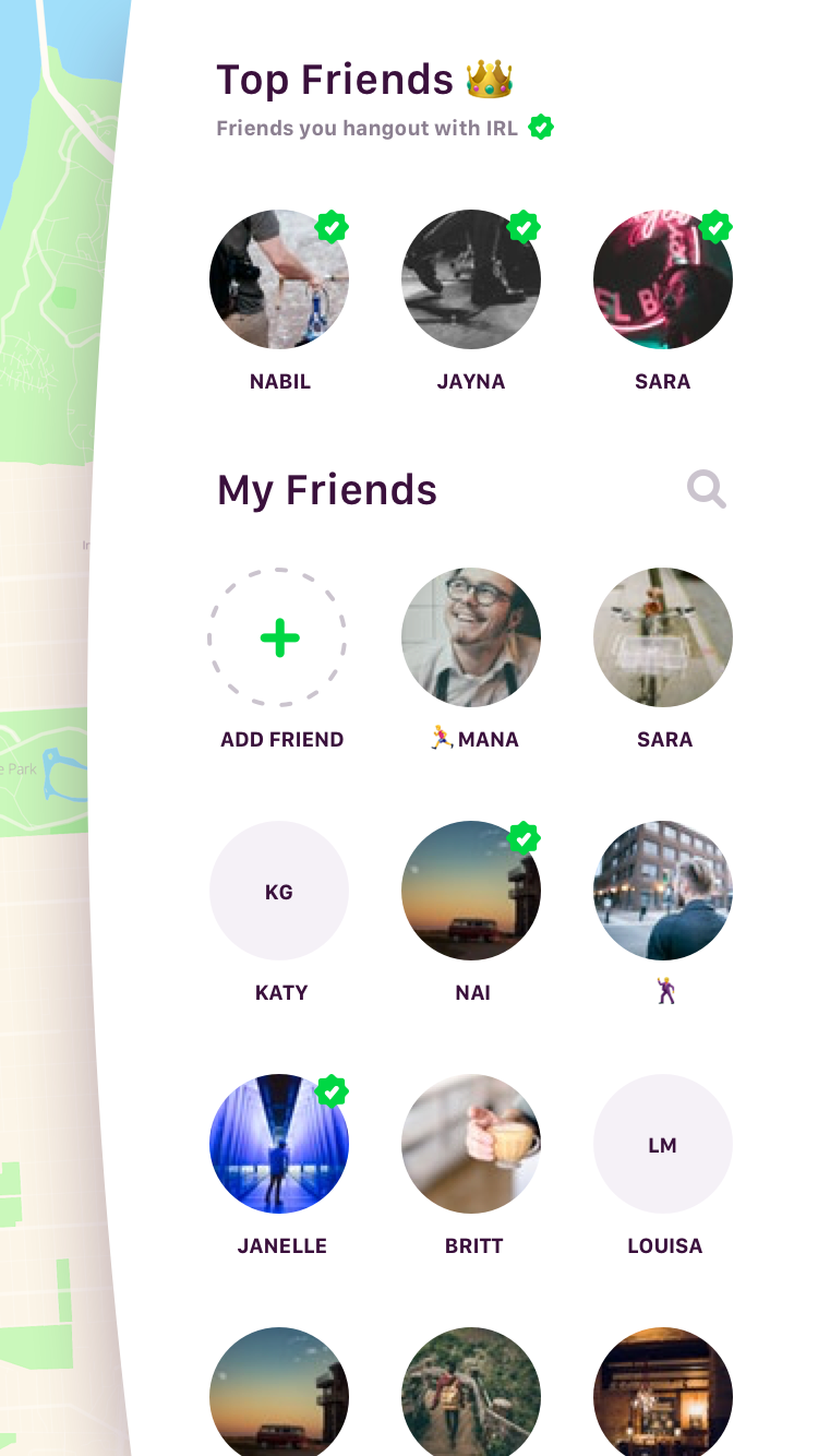
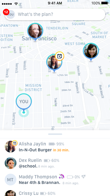
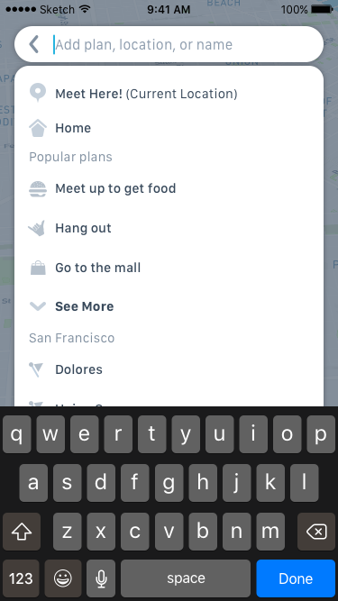
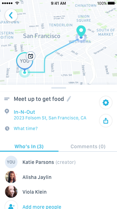
In the first iteration of the app, we focused on people on the map, and all plans were attached to the individual creators.
Usability Testing
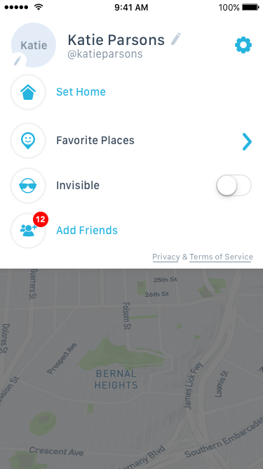
We invited 50+ high school and college students to our office to play with the app, as we were updating and changing our approach. We found some recurring issues with our designs.
Frustration in not knowing who is invited and who is not.
Desire to have more flexibilty in Favorite Places.
Confusion around plan creation.
Difficulty finding plans they're interested in.
Redesign
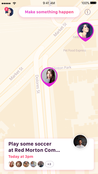
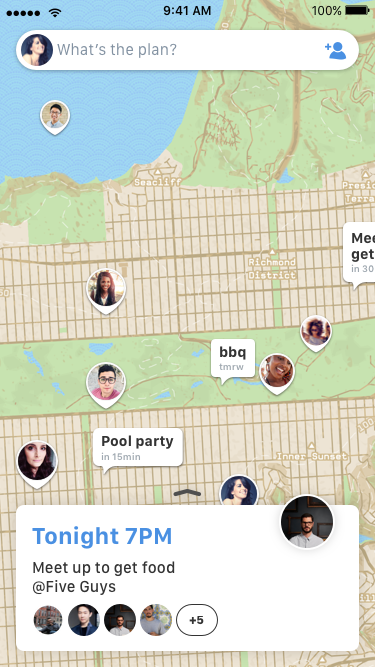
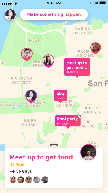
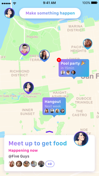
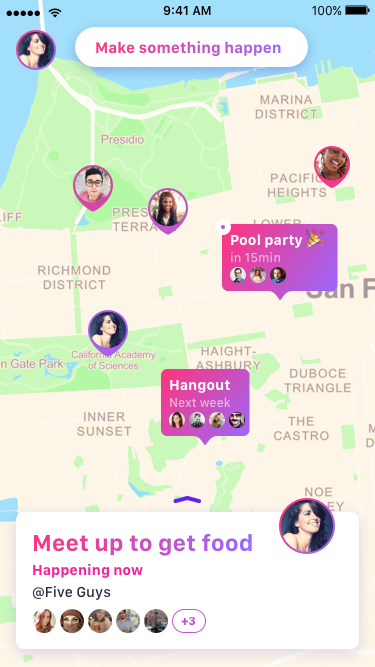
In this major redesign, we refocused the app to be structured around people and plans on the map.
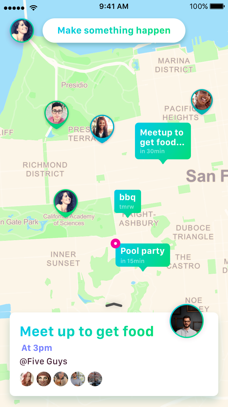
Each plan had its own pin, and a contextual card below. The most pertinent upcoming plans would be automatically hilighted.
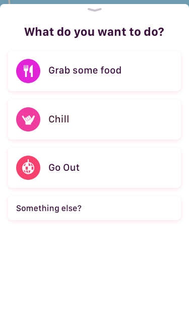
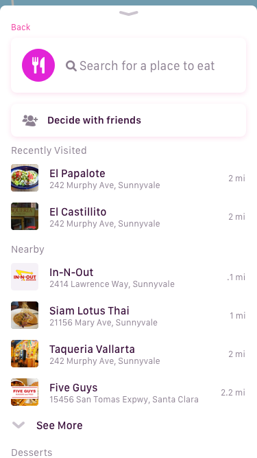
We simplified and optimized the plan creation flow, including place suggestions.
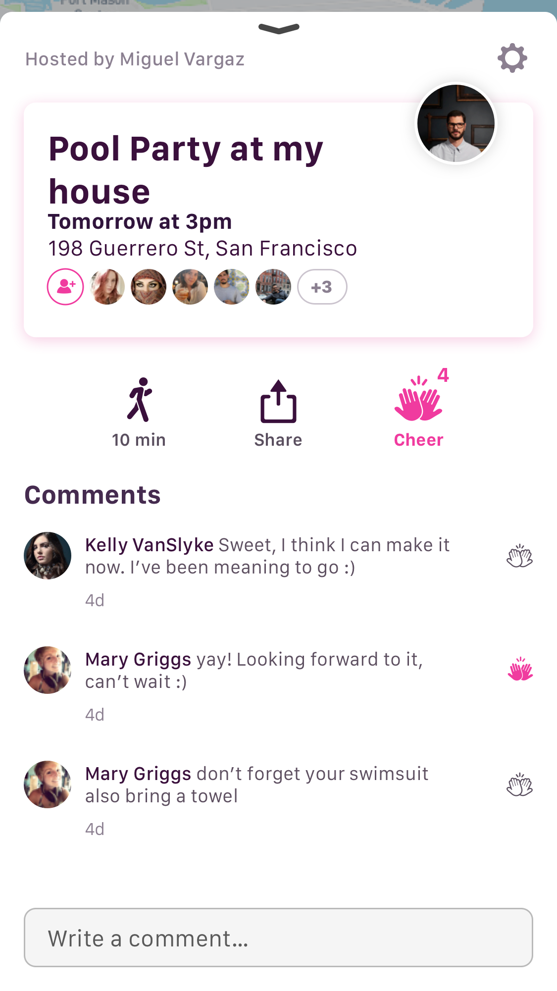
We also made open and hidden plans more intuitive.
We took on a major rebranding as well.


Icon Explorations
Wild Map Explorations
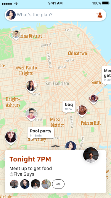
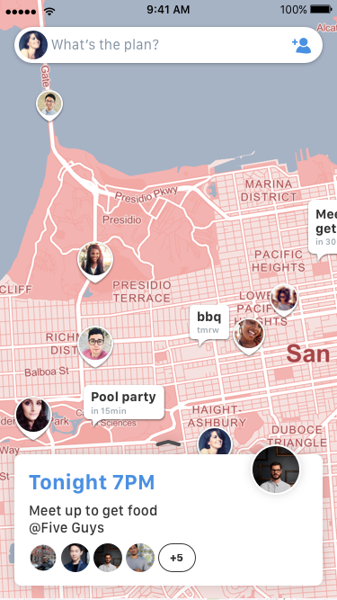
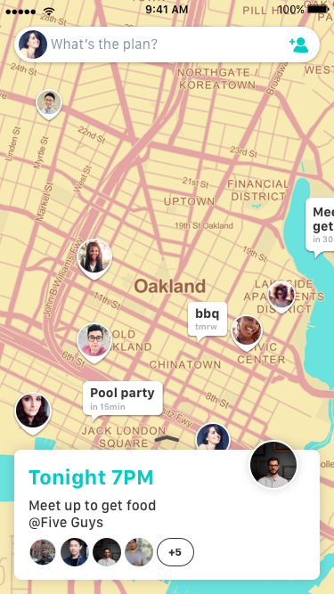
Narrowing in on Map Styling
Finessing Interactions
I worked through various options for animated transitions for the plan creation flow.
New On-Boarding
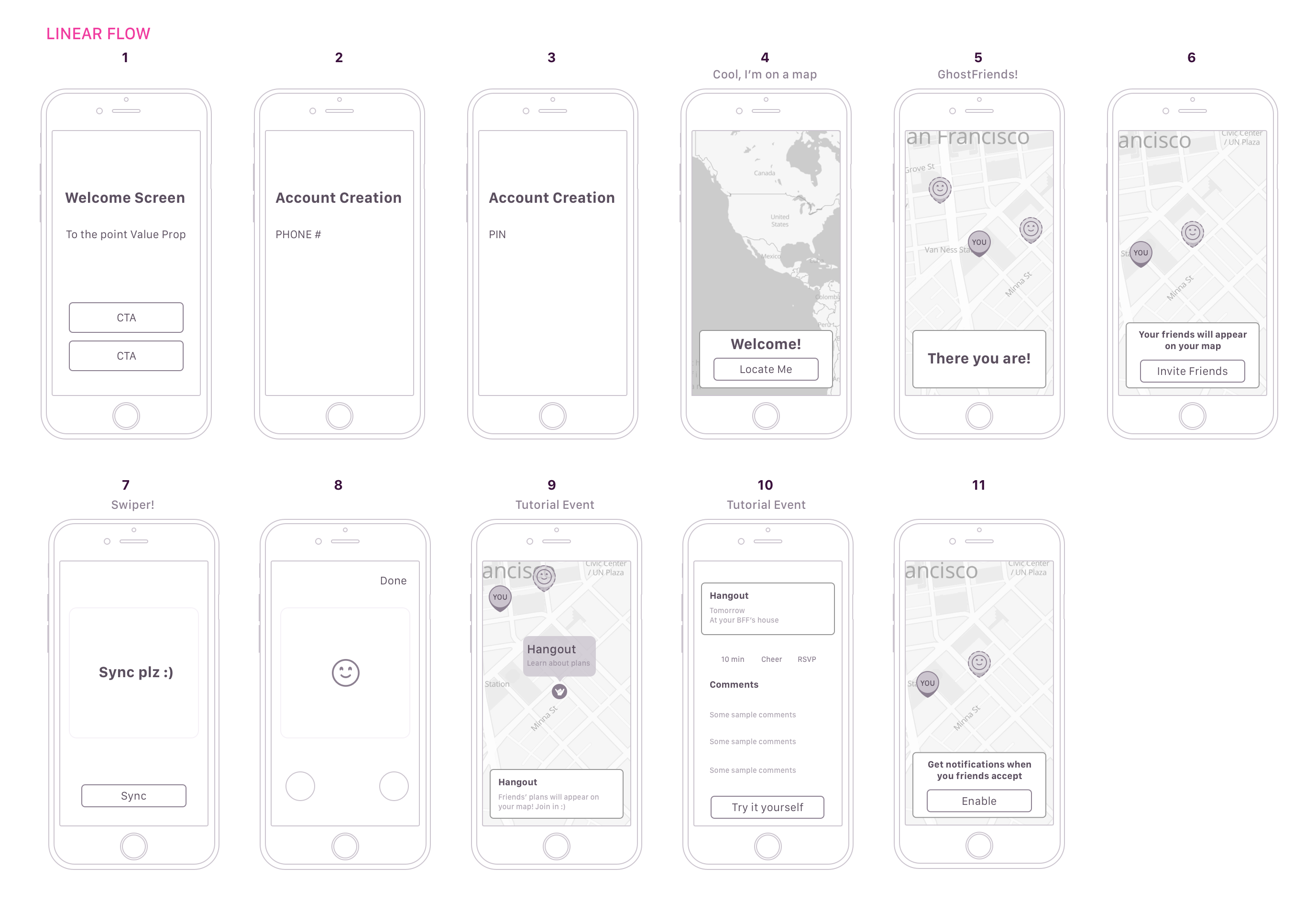
Since so much has changed with the app, I led the onboarding refresh.
The goal was to teach teens how to use the app in context of the interface.
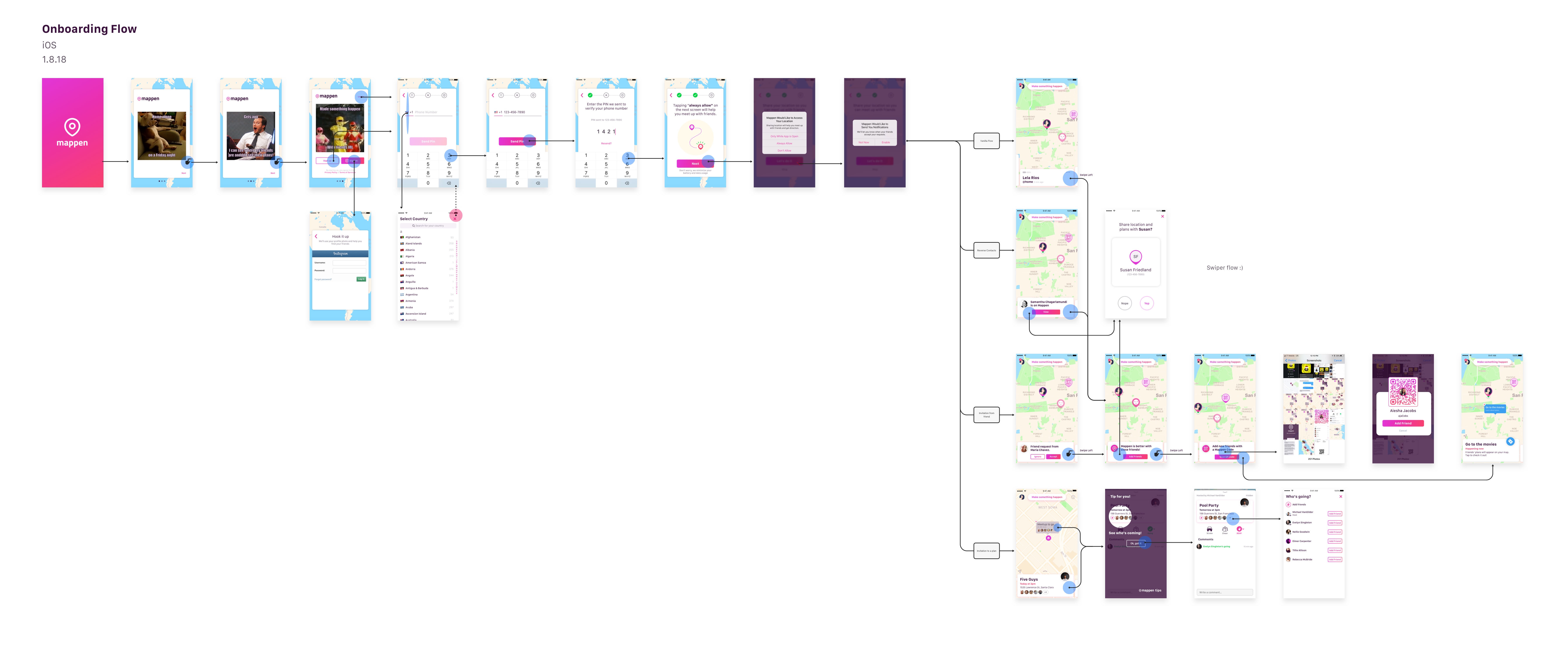
We decided to create a more contextual on-boarding, based on our knowledge of how new users came to the app. We wanted to get them to what they were looking for as quickly as possible.
Other Projects
